Lassiq website refresh
Project duration: 2 months
Lassiq is a Saudi company based in Riyadh that makes handmade stickers. Their website was in need of some love: they had a problem with their website and their brand image, and wanted it to reflect their love for stickers and the fun personality of the brand.
Owner’s words
“I want the website to stand out and have a personality the user can remember.”
The problems
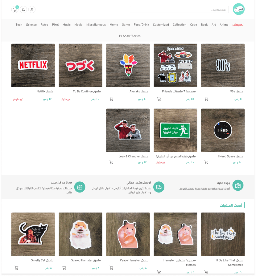
- From the first look at the website’s main page, it is obvious that it is cluttered:
- It has too many categories
- Product images are unappealing
- The process of finding a specific item was confusing
- I did a usability test with 6 test subjects (4 middle-aged and 2 older participants).
- The results can be summarized in these points:
- Users were lost between the pages
- No clear instructions to follow if you want to design your own stickers
- Navigation is a huge problem
- The process of purchase and return is too complicated
- Personality is missing on the website (branding)
Methods
- Website testing and inspecting
- User testing (giving a task and measuring how much time it takes)
- A user behavior study to reduce the steps needed to purchase and return (it took 7 steps to buy anything from the website)
- User interviews to understand the feel before the website visit
Testing
I wanted to test the access points in the website to validate their clarity to users.
I tested the website with 9 users from the business’s target audience. I gave each user a few tasks to perform on the website and recorded where they clicked, for example:
- Where would you click if you want to return items?
- Find some Rick and Morty stickers.
The process
One main call-to-action button
After a number of interviews and meetings with the business owner, it was clear that the website’s users want to buy stickers and to design their own as well. My main goal was to make these two processes as simple and clear as possible. Based on studies, a big call-to-action button with a contrasting color attracts the user’s attention and leads to more clicks.
The first wireframes and design went through usability testing and failed. They needed some iterations to reach the result I wanted, so I started sketching again and came up with a second design that was more accessible and cleaner than the previous one.
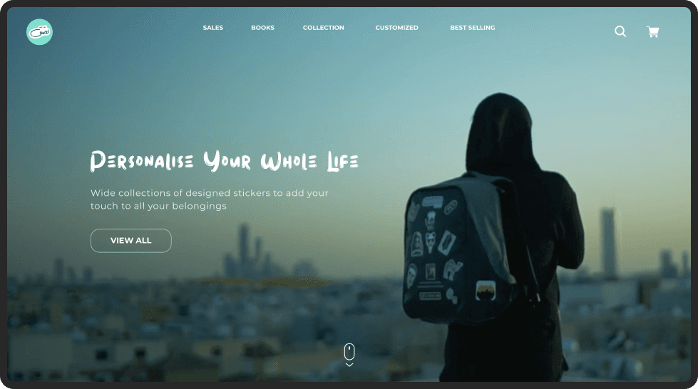
A big picture or video in the background
I wanted the website’s users to sense the true inspiration behind Lassiq. The owner wanted people to feel unique and special by personalizing their own things, and to always follow their dreams no matter how big they are.
Capturing these emotions in one image was a challenge. I read about angles, the placement of subjects in a picture and the meaning of colors, and sketched the picture the way I visualized it to make sure it worked with the layout of the website.
The return and customize product pages
Whenever we want to return a product, we think about the steps it takes. If it is simple and easy, the user will trust the business more. I used a QR code to save all the information needed to make a return (Lassiq’s customer service email, phone number and location) in one step: when the user scans the code, the information is saved to their phone.
I also simplified customizing stickers by reducing the number of steps needed to create one. Now the user can upload a picture right away, or create it on the website.
A brand jingle on call-to-action buttons
I wanted to add a feel to the brand and make it stand out from other websites, so users think about it even when they are not on it. Based on a psychology study, sounds are the shortest way to long-term memory. That’s why I added the sound of a sticker peeling when the user clicks on products to purchase.
Main outtakes
The use of color theory in any design can make huge changes the user may not notice, but unknowingly, it affects the user’s decisions. It affects the user journey of the website and, most importantly, the business’s profit. Smart color placement can generate more traffic and more users.