Site App
Project duration: 3 weeks
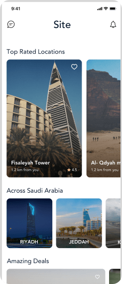
Site is a platform that connects content creators and filmmakers with location owners in the most organized and user-friendly way. The app solves the problem of location owners who are willing to rent their places, and filmmakers who struggle to find the perfect location for their vision.
The challenge
Making an app for location booking is easy. The challenge is making the experience different enough that users stay loyal to the app. The number one problem with booking apps is that people use them once, then cut out the middleman (the app) and deal with the location owner directly.
The solution
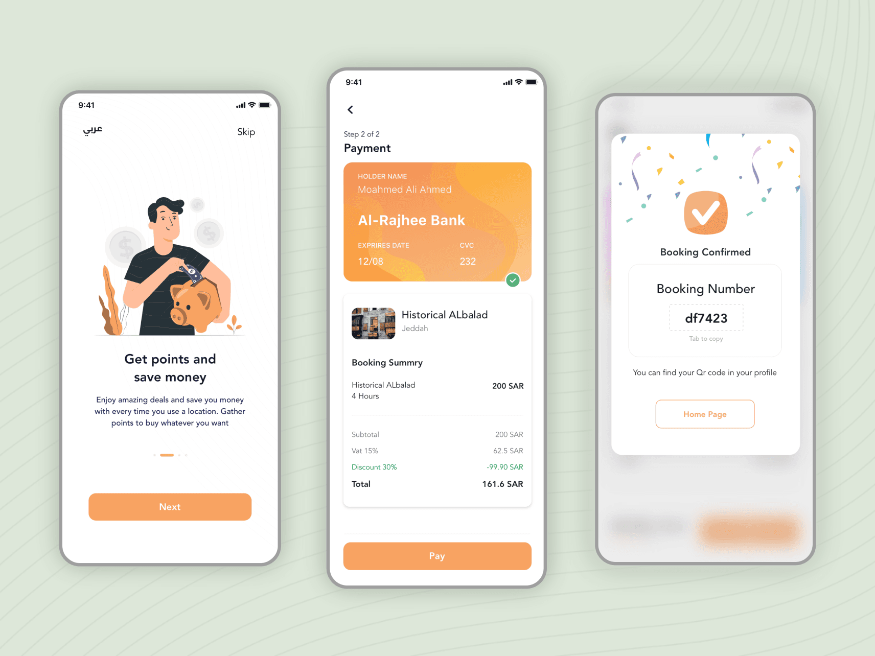
Gamifying the process by adding a points system and rankings. Every time a user completes a process (from booking to payment) the system provides a QR code as the booking reference. The location owner scans the QR code to receive the payment, and both users get points. Points unlock deals and higher ranks, and a higher user rating leads to more profit for the user.
Creating a persona
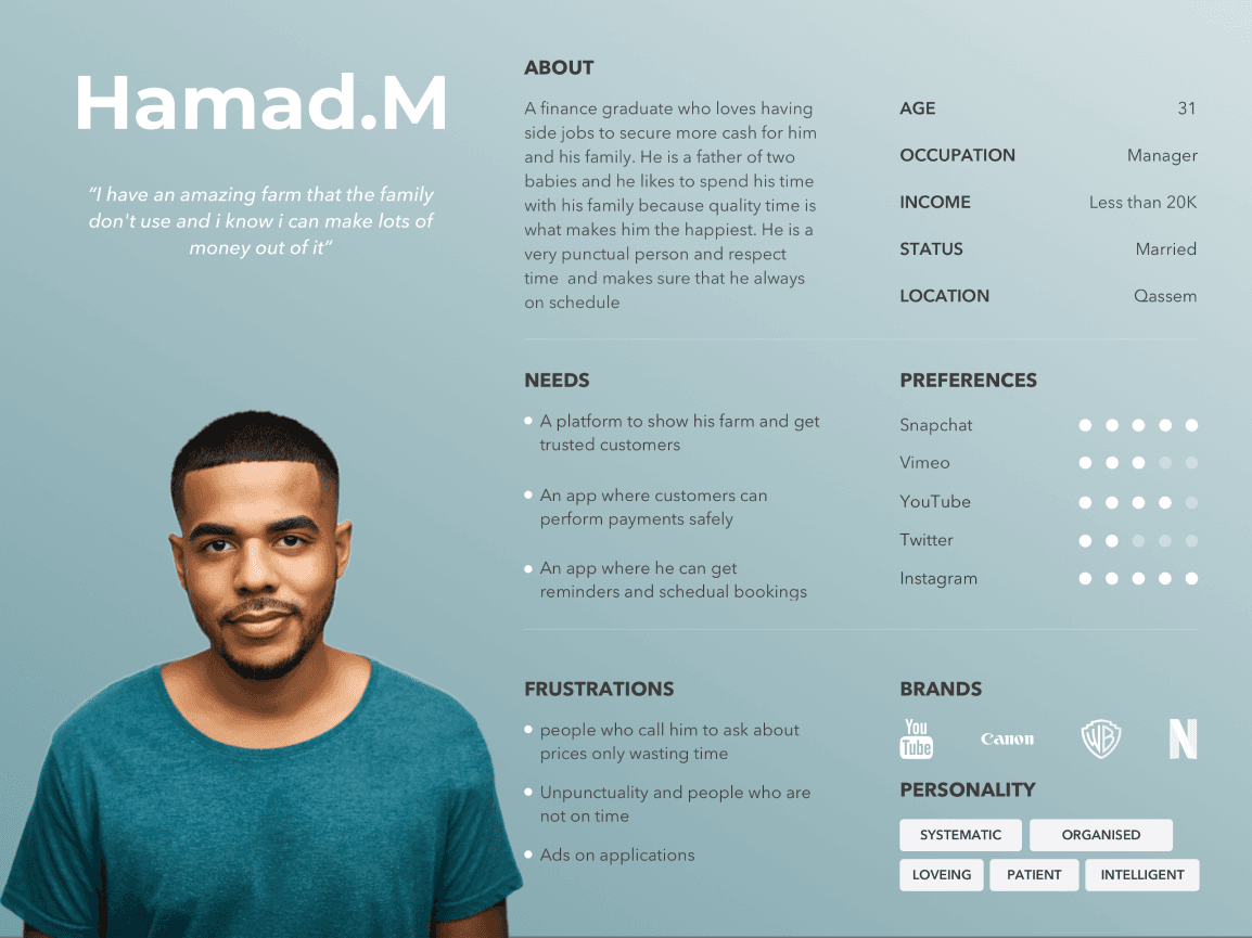
To solve a problem that faces a selected group of users, I have to study them and understand their frustrations. A persona helps me understand the user and keep development aligned with their needs. It shows what matters most to the user, so you can start by developing what’s relevant first.
User journey flow chart
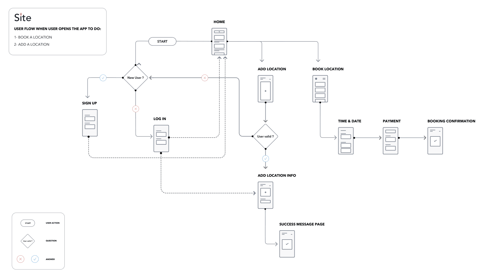
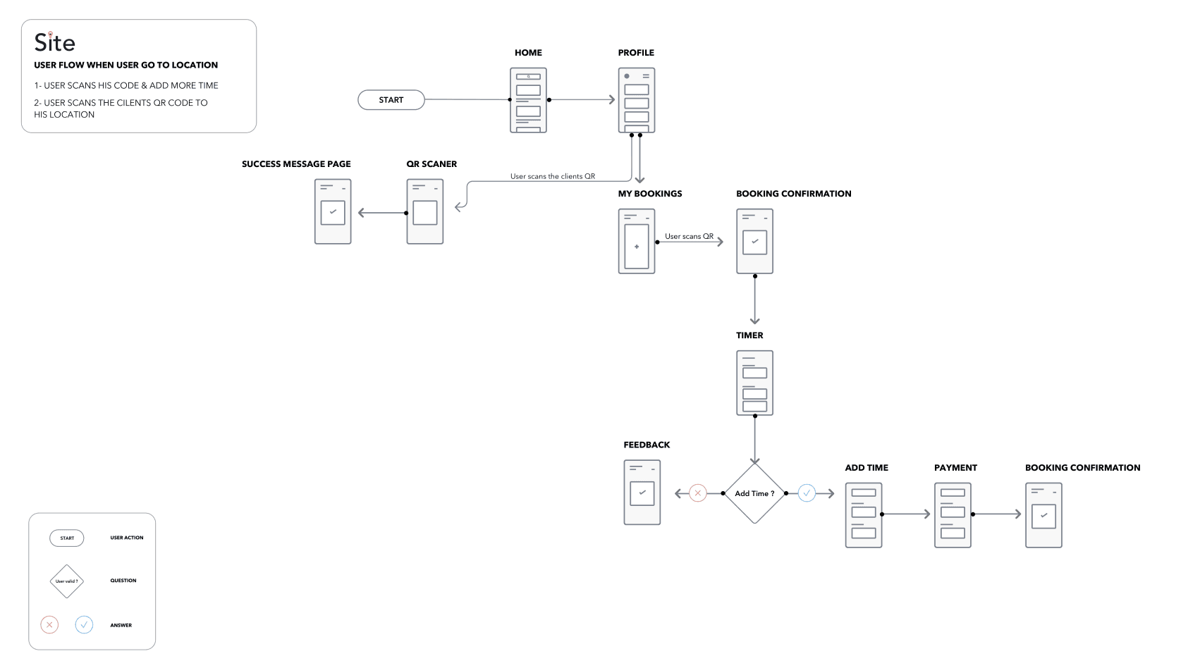
I created a user flow for the app’s processes to make sure they are obstacle-free and to reduce every process to the fewest steps required.
Designing solutions
Information architecture
IA focuses on organizing, structuring and labeling content in an effective and sustainable way. It is the main way to help both designer and user find information and finish tasks. I started by architecting the main part of the app, the tab bar menu: it is the main navigation and shows the depth of the pages, and it’s a method I use to see the connection points between pages.
Prototyping & testing
I created low-fidelity wireframes to finalize the content of each page before the final design. This saves time and starts usability testing early in the design process, which leads to fewer mistakes and blockers and lets development start by the end of the first design sprint.
Final design
Simplicity is the concept and direction I took for this app’s design. I chose one color other than black and white: the brand’s orange. Since the app serves all ages, I made sure the font has high readability and visibility so it is easier for elderly users to read.
Main outtakes
One of the main outtakes from this project is listening to users first, before jumping into creating solutions. Every problem can be looked at in more than one way, and you only see part of it as long as you assume what the problem is. Asking users keeps design decisions free of bias.